Drawing beautiful maps programmatically with R, sf and ggplot2 — Part 3: Layouts
EDIT: Following a suggestion from Adriano Fantini and code from Andy South, we replaced rworlmap by rnaturalearth. We also largely edited the text.
This tutorial is the third part in a series of three:
- General concepts illustrated with the world map
- Adding additional layers: an example with points and polygons
- Positioning and layout for complex maps (this document)
After the presentation of basic map concepts, and the flexible approach in layers implemented in ggplot2, this part illustrates how to achieve complex layouts, for instance with map insets, or several maps combined. Depending on the visual information that needs to be displayed, maps and their corresponding data might need to be arranged to create easy to read graphical representations. This tutorial will provide different approaches to arranges maps in the plot, in order to make the information portrayed more aesthetically appealing, and most importantly, convey the information better.
Getting started
Many R packages are available from CRAN, the Comprehensive R Archive Network, which is the primary repository of R packages. The full list of packages necessary for this series of tutorials can be installed with:
install.packages(c("cowplot", "googleway", "ggplot2", "ggrepel",
"ggspatial", "libwgeom", "sf", "rnaturalearth", "rnaturalearthdata"))
We start by loading the basic packages necessary for all maps, i.e. ggplot2 and sf. We also suggest to use the classic dark-on-light theme for ggplot2 (theme_bw), which is more appropriate for maps:
library("ggplot2")
theme_set(theme_bw())
library("sf")
The package rnaturalearth provides a map of countries of the entire world. Using ne_counties to pull the country data and,choose the scale. For returnclass, the setting can for be ‘sf’ and/or ‘sp’:
library("rnaturalearth")
library("rnaturalearthdata")

world <- ne_countries(scale='medium',returnclass = 'sf')
class(world)

## [1] "sf"
## [1] "data.frame"
General concepts
There are 2 solutions to combine sub-maps:
- Using “grobs”, i.e. graphic objects from
ggplot2, which can be inserted in the plot region using plot coordinates; - Using
ggdrawfrom packagecowplot, which allows to arrange new plots anywhere on the graphic device, including outer margins, based on relative position.
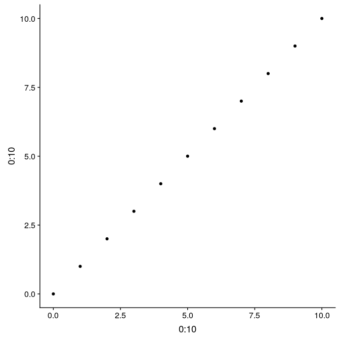
Here is a simple example illustrating the difference between the two, and their use. We first prepare a simple graph showing 11 points, with regular axes and grid (g1):
(g1 <- qplot(0:10, 0:10))
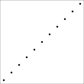
Graphs from ggplot2 can be saved, like any other R object. That allows to reuse and update the graph later on. For instance, we store in g1_void, a simplified version of this graph only the point data, but no decoration:
(g1_void <- g1 + theme_void() + theme(panel.border = element_rect(colour = "black",
    fill = NA)))
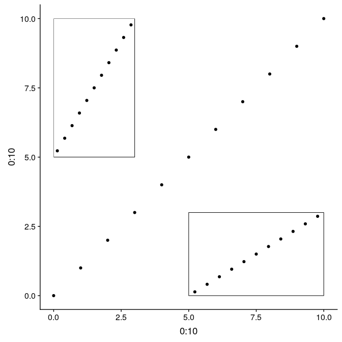
The function annotation_custom allows to arrange graphs together in the form of grobs (generated with ggplotGrob). Here we first plot the full graph g1, and then add two instances of g1_void in the upper-left and bottom-right corners of the plot region (as defined by xmin, xmax, ymin, and ymax):
Using grobs, and annotation_custom:
g1 +
    annotation_custom(
        grob = ggplotGrob(g1_void),
        xmin = 0,
        xmax = 3,
        ymin = 5,
        ymax = 10
    ) +
    annotation_custom(
        grob = ggplotGrob(g1_void),
        xmin = 5,
        xmax = 10,
        ymin = 0,
        ymax = 3
    )
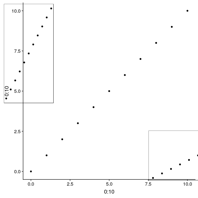
An alternative using the function ggdraw from the package cowplot allows to use relative positioning in the entire plot device. In this case, we build the graph on top of g1, but the initial call to ggdraw could actually be left empty to arrange subplots on an empty plot. Width and height of the subplots are relative from 0 to 1, as well x and y coordinates ([0,0] being the lower-left corner, [1,1] being the upper-right corner). Note that in this case, subplots are not limited to the actual plot region, but can be added anywhere on the device:
library(“cowplot”) ggdraw(g1) + draw_plot(g1_void, width = 0.25, height = 0.5, x = 0.02, y = 0.48) + draw_plot(g1_void, width = 0.5, height = 0.25, x = 0.75, y = 0.09)
Several maps side by side or on a grid
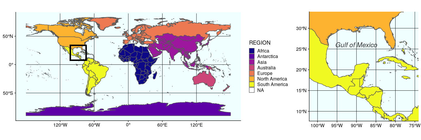
In this section, we present a way to arrange several maps side by side on a grid. While this could be achieved manually after exporting each individual map, this allows to 1) have reproducible code to this end; 2) full control on how individual maps are positioned.
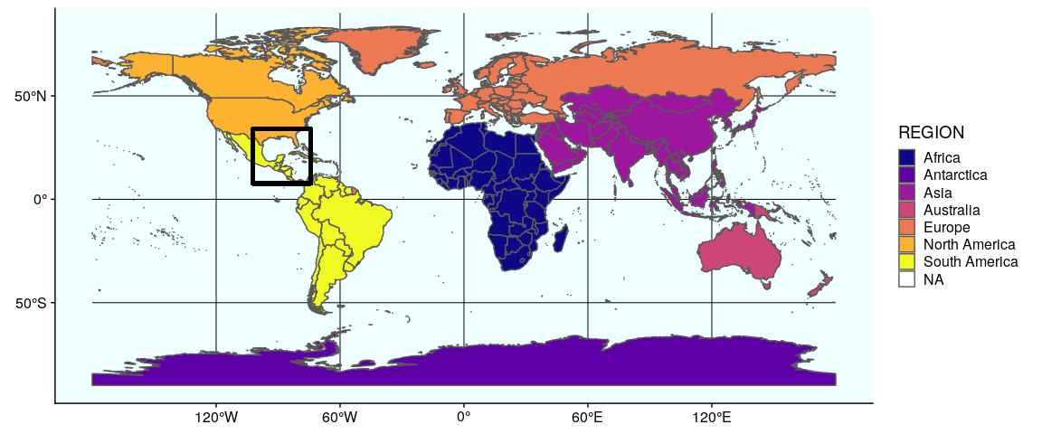
In this example, a zoom in on the Gulf of Mexico is placed on the side of the world map (including its legend). This illustrates how to use a custom grid, which can be made a lot more complex with more elements.
We now prepare the subplots, starting by the world map with a rectangle around the Gulf of Mexico (see Section 1 and 2 for the details of how to prepare this map):
Prepare the subplots, #1 world map:
(gworld <- ggplot(data = world) +
  geom_sf(aes(fill = region_wb)) +
  geom_rect(xmin = -102.15, xmax = -74.12, ymin = 7.65, ymax = 33.97,
     fill = NA, colour = "black", size = 1.5) +
  scale_fill_viridis_d(option = "plasma") +
  theme(panel.background = element_rect(fill = "azure"),
     panel.border = element_rect(fill = NA)))
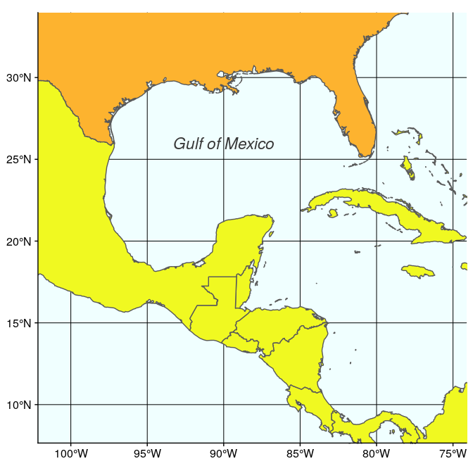
The second map is very similar, but centered on the Gulf of Mexico (using coord_sf):
(ggulf <- ggplot(data = world) +
  geom_sf(aes(fill = region_wb)) +
  annotate(geom = "text", x = -90, y = 26, label = "Gulf of Mexico",
     fontface = "italic", color = "grey22", size = 6) +
  coord_sf(xlim = c(-102.15, -74.12), ylim = c(7.65, 33.97), expand = FALSE) +
  scale_fill_viridis_d(option = "plasma") +
  theme(legend.position = "none", axis.title.x = element_blank(),
     axis.title.y = element_blank(), panel.background = element_rect(fill = "azure"),
     panel.border = element_rect(fill = NA)))
Finally, we just need to arrange these two maps, which can be easily done with annotation_custom. Note that in this case, we use an empty call to ggplot to position the two maps on an empty background (of size 3.3 × 1):
ggplot() +
    coord_equal(xlim = c(0, 3.3), ylim = c(0, 1), expand = FALSE) +
    annotation_custom(ggplotGrob(plot1), xmin = 0, xmax = 1.5, ymin = 0,
                    ymax = 1) +
    annotation_custom(ggplotGrob(plot2), xmin = 1.5, xmax = 3, ymin = 0,
                    ymax = 1) +
    theme_void()
The second approach using the function plot_grid from cowplot to arrange ggplot figures, is quite versatile. Any ggplot figure can be arranged just like the figure above. Several arguments adjust map placement, such as nrow and ncol which define the number of row and columns, respectively, and rel_widths which establishes the relative width of each map. In our case, we want both maps on a single row, the first map gworld to have a relative width of 2.3, and the map ggulf a relative width of 1.
plot_grid(gworld, ggulf, nrow = 1, rel_widths = c(2.3, 1))
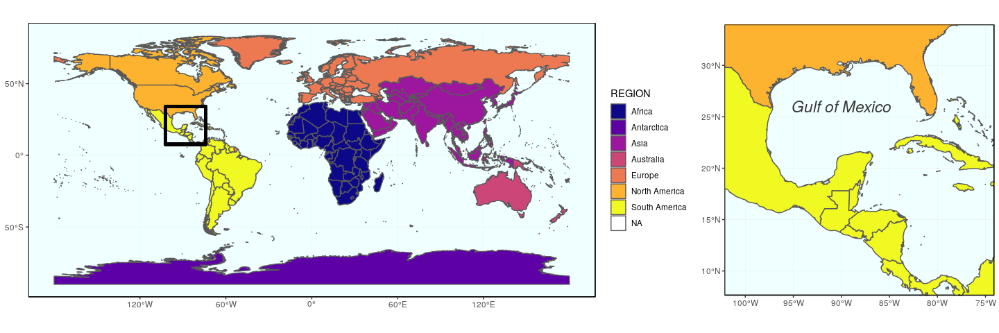
The argument align can be used to align subplots horizontally (align = "h"), vertically (align = "v"), or both (align = "hv"), so that the axes and plot region match each other. Note also the existence of get_legend (cowplot), which extract the legend of a plot, which can then be used as any object (for instance, to place it precisely somewhere on the map).
Both maps created above (using ggplot and annotation_custom, or using cowplot and plot_grid) can be saved as usual using ggsave (to be used after plotting the desired map):
ggsave("grid.pdf", width = 15, height = 5)
Map insets
To inset maps directly on a background map, both solutions presented earlier are viable (and one might prefer one or the other depending on relative or absolute coordinates). We will illustrate this using a map of the 50 states of the United States, including Alaska and Hawaii (note: both Alaska and Hawaii will not be to scale).
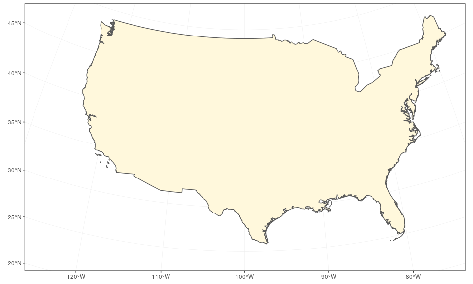
We start by preparing the continental states first, using the reference US National Atlas Equal Area projection (CRS 2163). The main trick is to find the right coordinates, in the projection used, and this may cause some fine tuning at each step. Here, we enlarge the extent of the plot region on purpose to give some room for the insets:
usa <- subset(world, admin == "United States of America")
(mainland <- ggplot(data = usa) +
     geom_sf(fill = "cornsilk") +
     coord_sf(crs = st_crs(2163), xlim = c(-2500000, 2500000), ylim = c(-2300000,
         730000)))
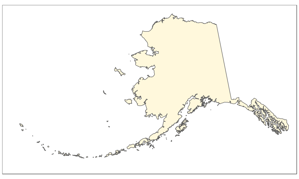
The Alaska map is plotted using the reference Alaska Albers projection (CRS 3467). Note that graticules and coordinates are removed with datum = NA:
(alaska <- ggplot(data = usa) +
     geom_sf(fill = "cornsilk") +
     coord_sf(crs = st_crs(3467), xlim = c(-2400000, 1600000), ylim = c(200000,
         2500000), expand = FALSE, datum = NA))
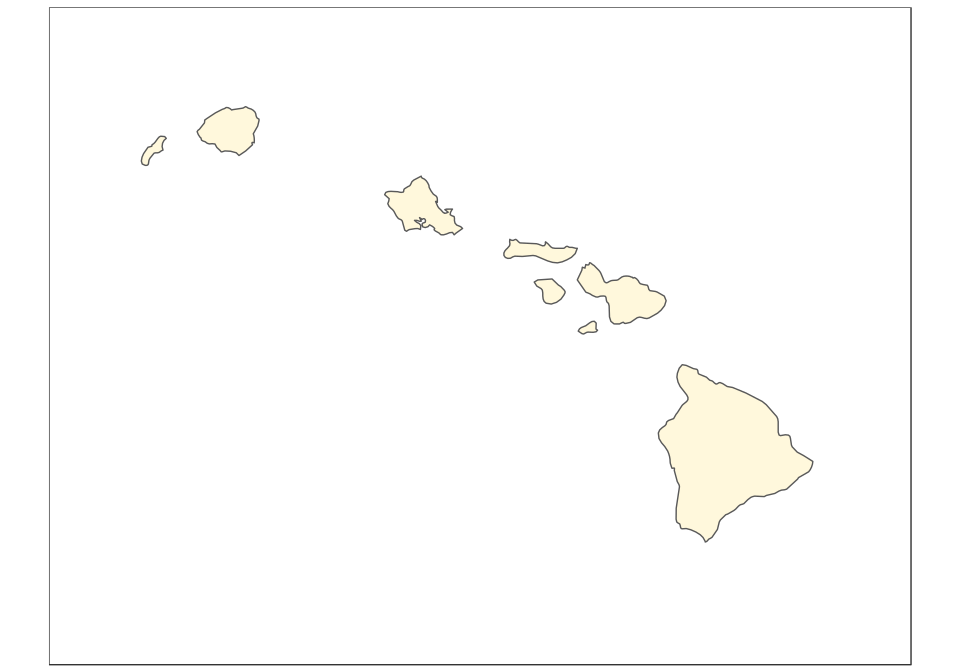
And now the map of Hawaii, plotted using the reference Old Hawaiian projection (CRS 4135):
(hawaii  <- ggplot(data = usa) +
     geom_sf(fill = "cornsilk") +
     coord_sf(crs = st_crs(4135), xlim = c(-161, -154), ylim = c(18,
         23), expand = FALSE, datum = NA))
The final map can be created using ggplot2 only, with the help of the function annotation_custom. In this case, we use arbitrary ratios based on the size of the subsets above (note the difference based on maximum minus minimum x/y coordinates):
mainland +
 annotation_custom(
      grob = ggplotGrob(alaska),
      xmin = -2750000,
      xmax = -2750000 + (1600000 - (-2400000))/2.5,
      ymin = -2450000,
      ymax = -2450000 + (2500000 - 200000)/2.5
  ) +
  annotation_custom(
      grob = ggplotGrob(hawaii),
      xmin = -1250000,
      xmax = -1250000 + (-154 - (-161))*120000,
      ymin = -2450000,
      ymax = -2450000 + (23 - 18)*120000
  )
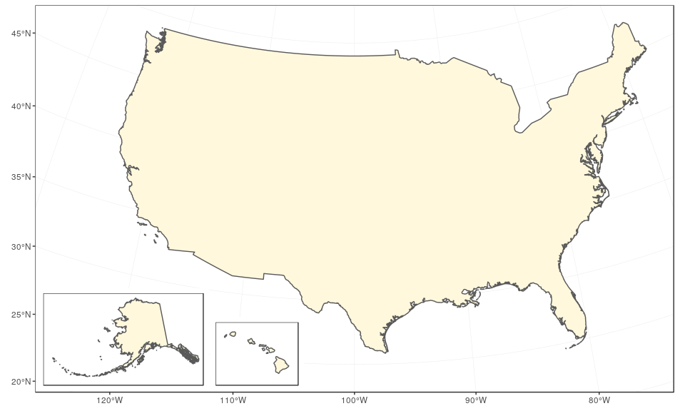
The same can be achieved with the same logic using cowplot and the function draw_plot, in which case it is easier to define the ratios of Alaska and Hawaii first:
(ratioAlaska <- (2500000 - 200000) / (1600000 - (-2400000)))

## [1] 0.575

(ratioHawaii  <- (23 - 18) / (-154 - (-161)))

## [1] 0.7142857

ggdraw(mainland) +
    draw_plot(alaska, width = 0.26, height = 0.26 * 10/6 * ratioAlaska,
        x = 0.05, y = 0.05) +
    draw_plot(hawaii, width = 0.15, height = 0.15 * 10/6 * ratioHawaii,
        x = 0.3, y = 0.05)
Again, both plots can be saved using ggsave:
ggsave("map-us-ggdraw.pdf", width = 10, height = 6)
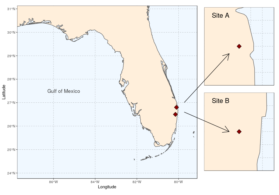
Several maps connected with arrows
To bring about a more lively map arrangement, arrows can be used to direct the viewer’s eyes to specific areas in the plot. The next example will create a map with zoomed in areas, connected by arrows.
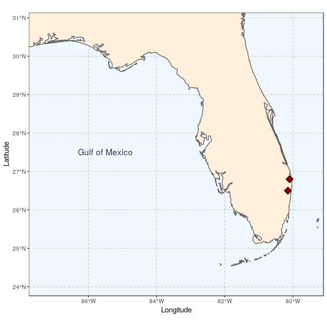
We start by creating the general map, here a map of Florida with the site locations (see Tutorial 2 for the details):
sites <- st_as_sf(data.frame(longitude = c(-80.15, -80.1), latitude = c(26.5,
26.8)), coords = c("longitude", "latitude"), crs = 4326,
agr = "constant")


(florida <- ggplot(data = world) +
     geom_sf(fill = "antiquewhite1") +
     geom_sf(data = sites, size = 4, shape = 23, fill = "darkred") +
     annotate(geom = "text", x = -85.5, y = 27.5, label = "Gulf of Mexico",
         color = "grey22", size = 4.5) +
     coord_sf(xlim = c(-87.35, -79.5), ylim = c(24.1, 30.8)) +
     xlab("Longitude")+ ylab("Latitude")+
     theme(panel.grid.major = element_line(colour = gray(0.5), linetype = "dashed",
         size = 0.5), panel.background = element_rect(fill = "aliceblue"),
         panel.border = element_rect(fill = NA)))
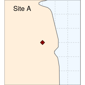
We then prepare two study sites (simply called A and B here):
(siteA <- ggplot(data = world) +
     geom_sf(fill = "antiquewhite1") +
     geom_sf(data = sites, size = 4, shape = 23, fill = "darkred") +
     coord_sf(xlim = c(-80.25, -79.95), ylim = c(26.65, 26.95), expand = FALSE) +
     annotate("text", x = -80.18, y = 26.92, label= "Site A", size = 6) +
     theme_void() +
     theme(panel.grid.major = element_line(colour = gray(0.5), linetype = "dashed",
         size = 0.5), panel.background = element_rect(fill = "aliceblue"),
         panel.border = element_rect(fill = NA)))
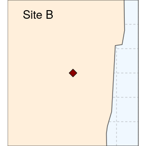
(siteB <- ggplot(data = world) +
     geom_sf(fill = "antiquewhite1") +
     geom_sf(data = sites, size = 4, shape = 23, fill = "darkred") +
     coord_sf(xlim = c(-80.3, -80), ylim = c(26.35, 26.65), expand = FALSE) +
     annotate("text", x = -80.23, y = 26.62, label= "Site B", size = 6) +
     theme_void() +
     theme(panel.grid.major = element_line(colour = gray(0.5), linetype = "dashed",
         size = 0.5), panel.background = element_rect(fill = "aliceblue"),
         panel.border = element_rect(fill = NA)))
As we want to connect the two subplots to main map using arrows, the coordinates of the two arrows will need to be specified before plotting. We prepare a data.frame storing start and end coordinates (x1 and x2 on the x-axis, y1 and y2 on the y-axis):
arrowA <- data.frame(x1 = 18.5, x2 = 23, y1 = 9.5, y2 = 14.5)
arrowB <- data.frame(x1 = 18.5, x2 = 23, y1 = 8.5, y2 = 6.5)
Using ggplot only, we simply follow the same approach as before to place several maps side by side, and then add arrows using the function geom_segment and the argument arrow = arrow():
ggplot() +
    coord_equal(xlim = c(0, 28), ylim = c(0, 20), expand = FALSE) +
    annotation_custom(ggplotGrob(florida), xmin = 0, xmax = 20, ymin = 0,
        ymax = 20) +
    annotation_custom(ggplotGrob(siteA), xmin = 20, xmax = 28, ymin = 11.25,
        ymax = 19) +
    annotation_custom(ggplotGrob(siteB), xmin = 20, xmax = 28, ymin = 2.5,
        ymax = 10.25) +
    geom_segment(aes(x = x1, y = y1, xend = x2, yend = y2), data = arrowA,
        arrow = arrow(), lineend = "round") +
    geom_segment(aes(x = x1, y = y1, xend = x2, yend = y2), data = arrowB,
        arrow = arrow(), lineend = "round") +
    theme_void()
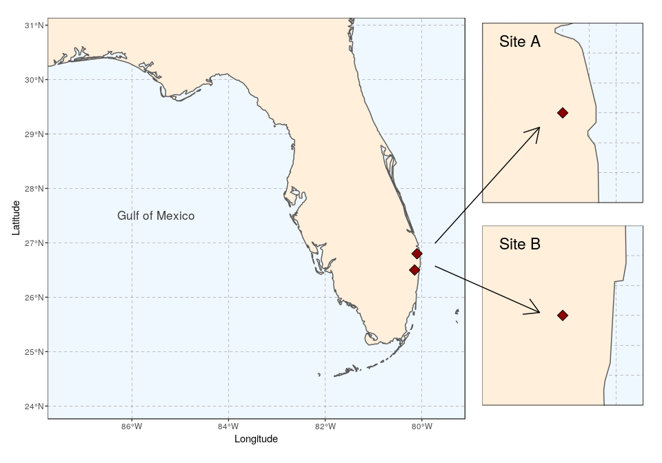
The package cowplot (with draw_plot) can also be used for a similar result, with maybe a somewhat easier syntax:
ggdraw(xlim = c(0, 28), ylim = c(0, 20)) +
    draw_plot(florida, x = 0, y = 0, width = 20, height = 20) +
    draw_plot(siteA, x = 20, y = 11.25, width = 8, height = 8) +
    draw_plot(siteB, x = 20, y = 2.5, width = 8, height = 8) +
    geom_segment(aes(x = x1, y = y1, xend = x2, yend = y2), data = arrowA,
        arrow = arrow(), lineend = "round") +
    geom_segment(aes(x = x1, y = y1, xend = x2, yend = y2), data = arrowB,
        arrow = arrow(), lineend = "round")
Again, both plot can be saved using ggsave:
ggsave("florida-sites.pdf", width = 10, height = 7)